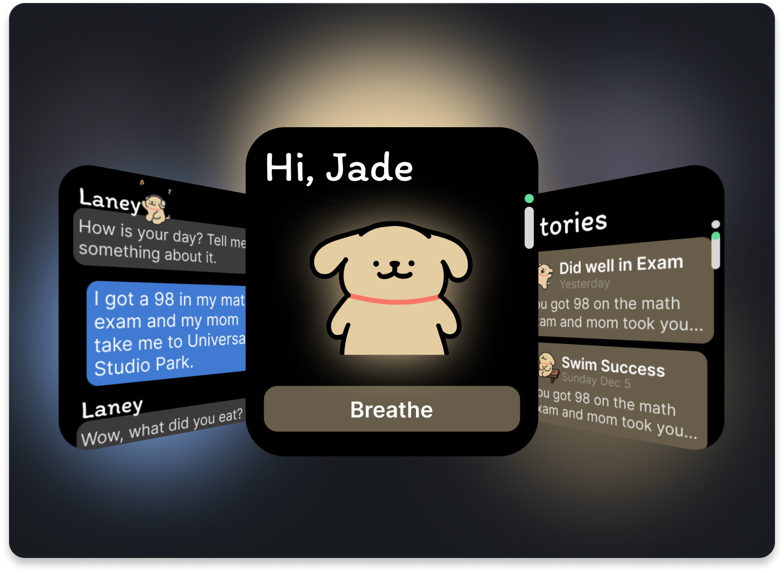
Laney
Nurturing Mental Wellness, Strengthening Parent-child Bonds
Project Info
Role
Sole Designer
Time Period
50 hours
Tools
Figma, Procreate, Mid-journey
Skills
UX Design, UI Design, Conversation Design, Wearable Device
The Problem
Children face various stressors but often struggle to communicate their feelings, especially in East Asian cultures where family dynamics can inhibit open dialogue. This leaves parents disconnected from their children's emotional wellbeing.
Design Opportunity
Create a solution to non-intrusively analyze children's patterns and provide parents with emotional insights, fostering trust and better communication.
Research
After identifying the initial concept, I moved on to validating the user needs through interviews. My approach involved engaging with both children and parents to understand their emotional needs and daily habits.
I conducted six user interviews, speaking directly with parents and students to gather insights into their challenges and goals. These interviews helped me shape the app's core features, ensuring they aligned with real-world needs.
Through interviews with three boys and three girls and their parents in China.
One More Thing - Meet Lian
During my research, I met Lian, my mother and a teacher at a training institution, who played a crucial role in facilitating my conversations with families. Through and an in-depth follow-up interview, I gained valuable insights into children's mental health through her perspective.
Lian demonstrates a remarkable ability to listen and support children when they need it most, helping them view challenges from different angles. She also serves as a bridge between children and parents, providing essential feedback that enables better understanding and communication within families.
Her role illuminated a key opportunity for my app: the potential to bring every family a supportive figure like Lian, fostering stronger connections between children and their parents.
Insights
Personas
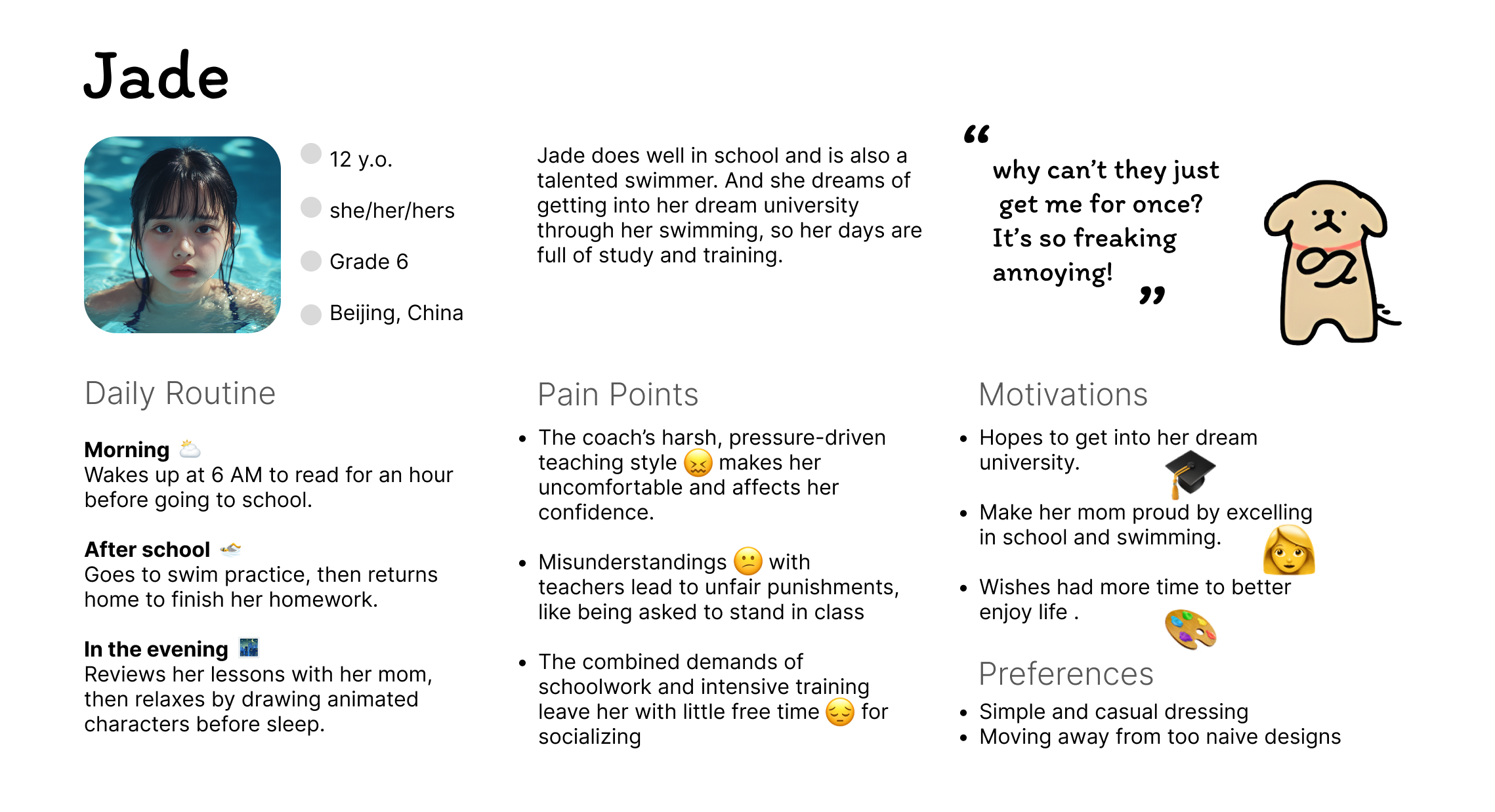
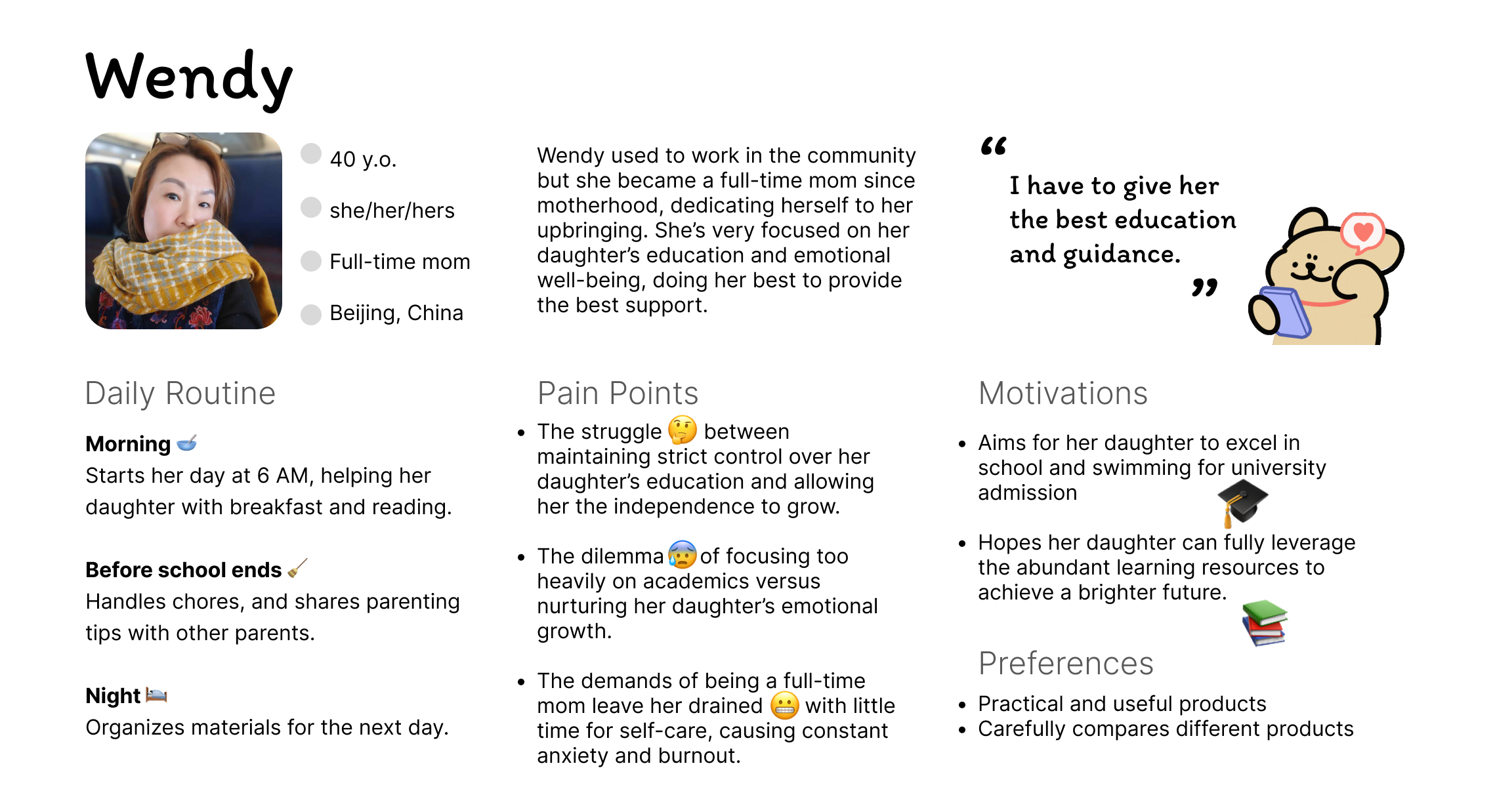
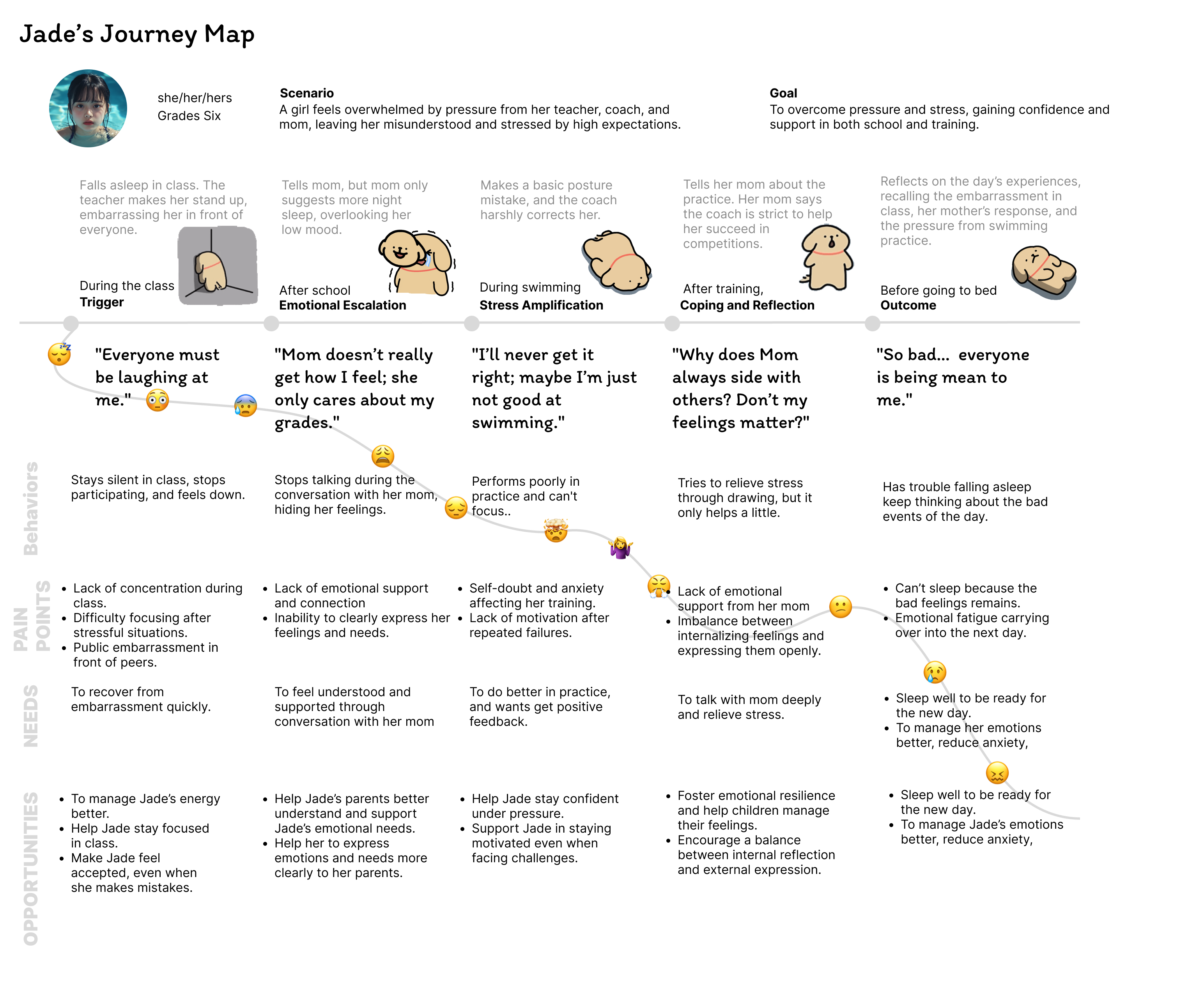
Journey Map
Define
Card Sorting
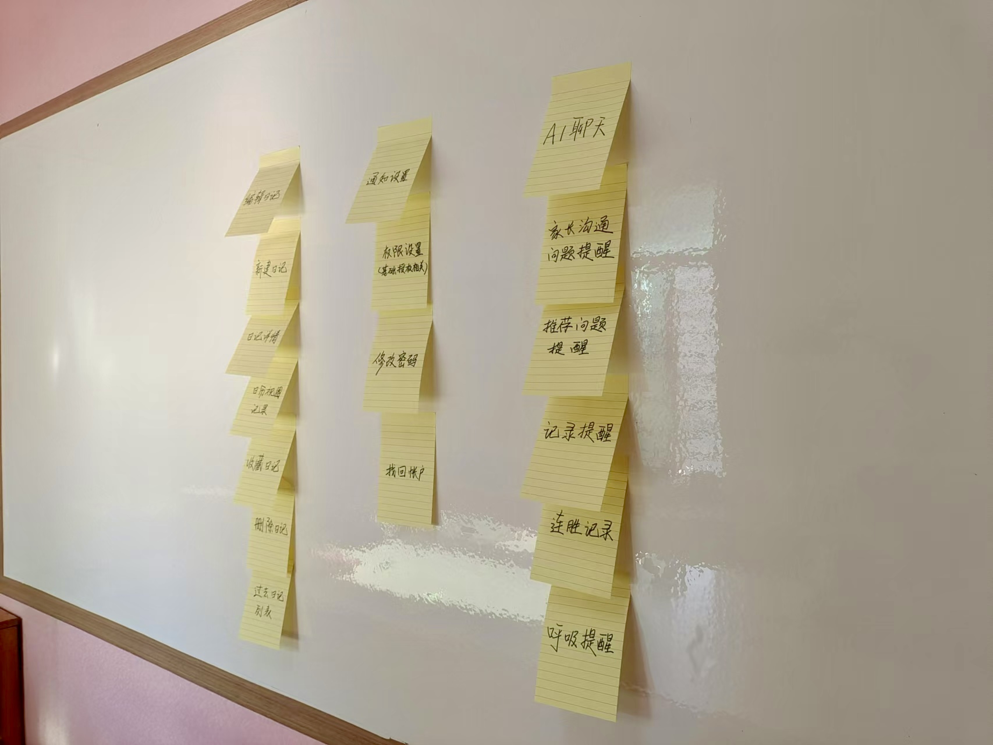
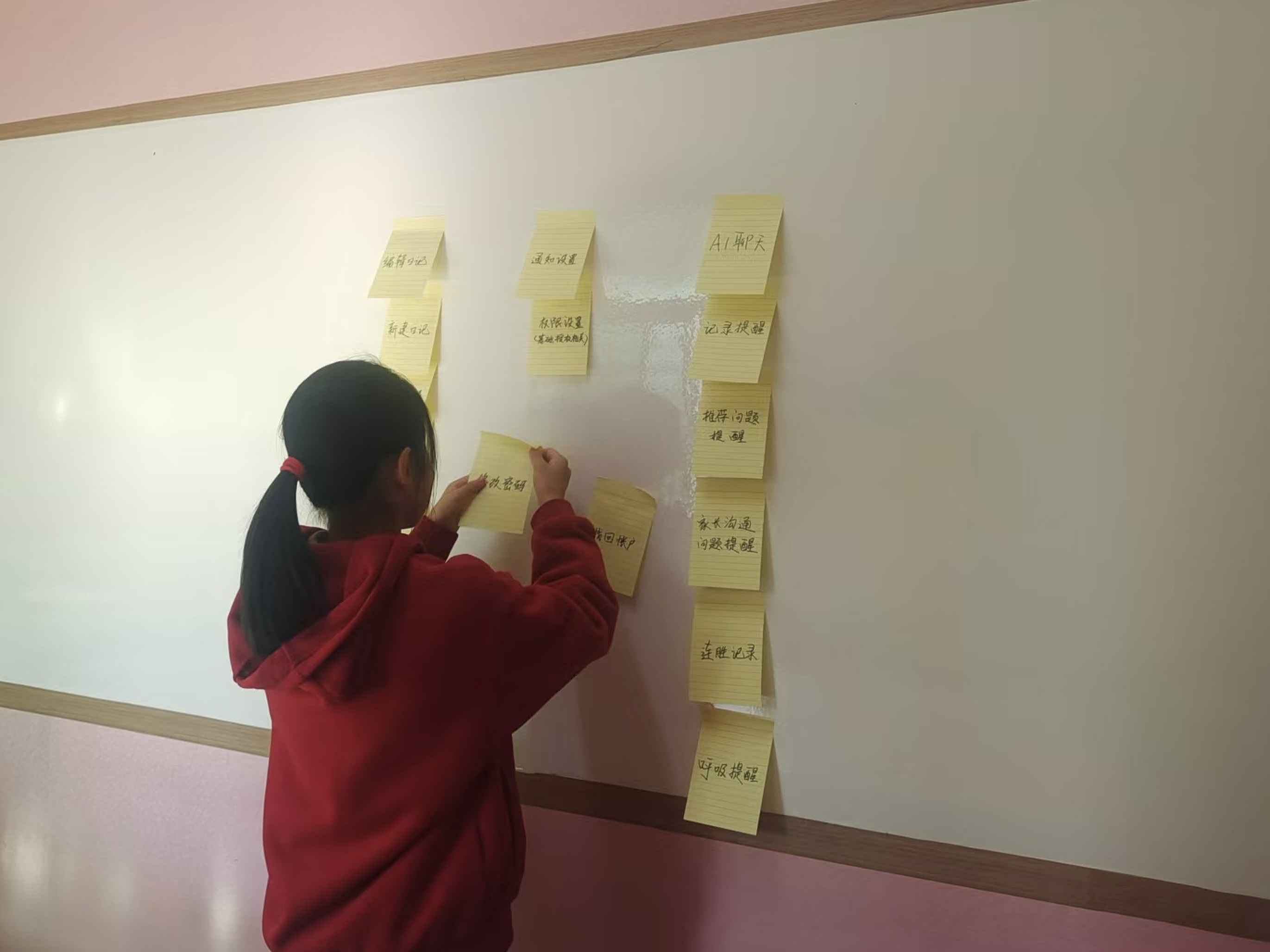
I conducted a card sorting exercise with two participants (a 12-year-old boy and a 13-year-old girl). The goal was to understand how users categorize features and identify patterns in their mental models.
There were differing views on "Create Story" and "Privacy":
- Boy's Perspective: He saw "Create Story" as a tool integrated with "AI Chat" to manage and enhance story creation, with privacy settings tied to AI-assisted content.
- Girl's Perspective: She preferred a traditional approach, treating "Create Story" as independent from "AI Chat," viewing the latter as a standalone feature.
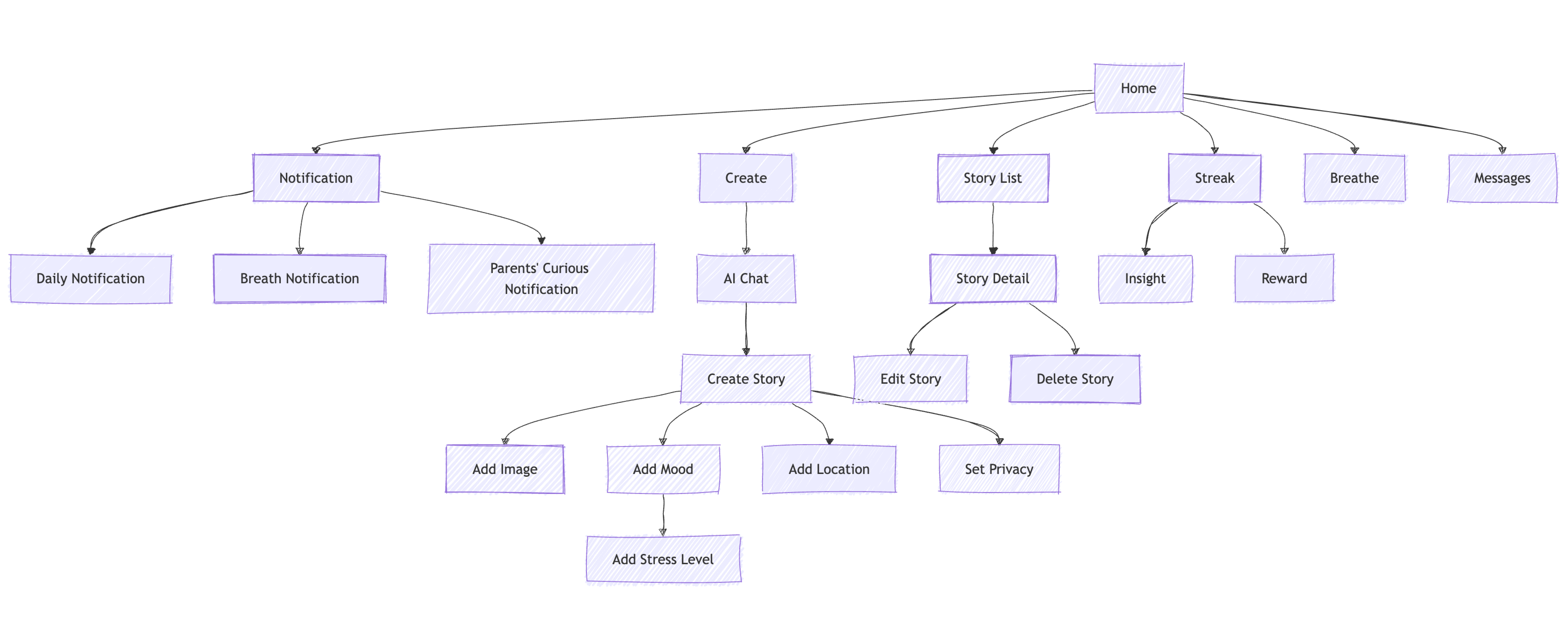
Information Architecture
Ideate
Lo-fi Wireframes
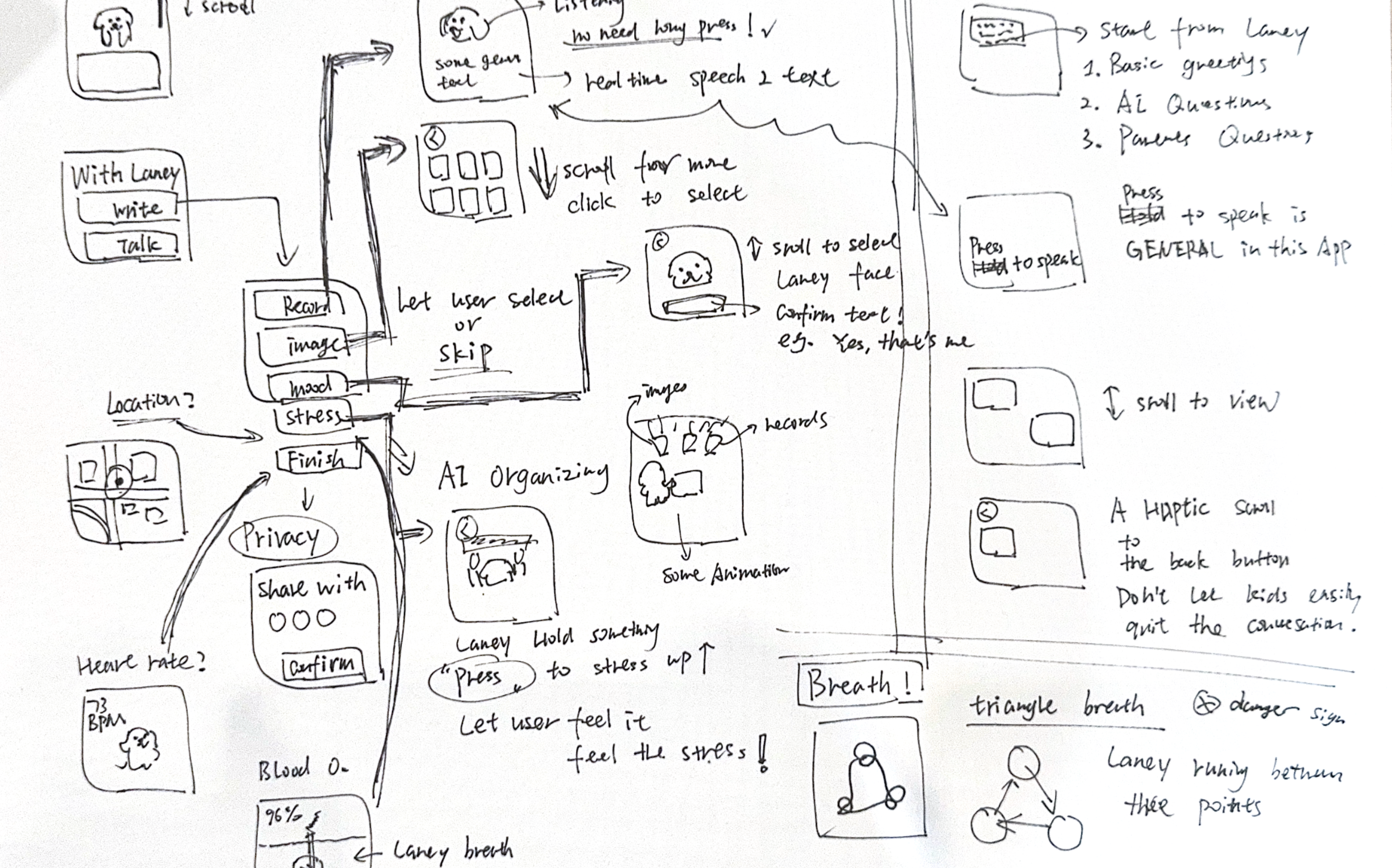
Building upon research insights and information architecture, I created low-fidelity wireframes to rapidly explore various design possibilities. This quick sketching process allowed me to visualize different layouts and interaction patterns, transforming abstract ideas into tangible solutions.
Conversation Design
The heart of Laney lies in its ability to foster meaningful dialogue with children. I carefully crafted conversation flows that balance empathy with purpose, ensuring interactions are both supportive and developmentally appropriate.
UI Design
The design of Laney's UI reflects a thoughtful and child-friendly approach, combining elements of comfort, playfulness, and trust.
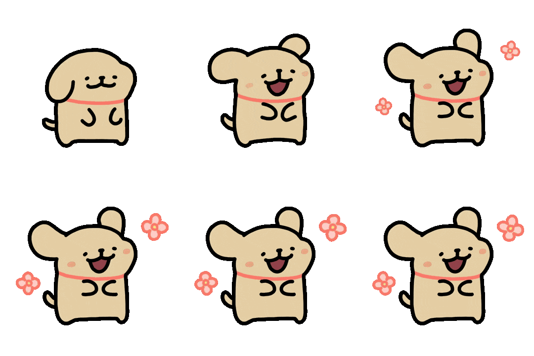
Mascot: The Golden Retriever Line Art Dog
The centerpiece of Laney's branding is the line-art Golden Retriever, inspired by a character from a popular sticker series. In the stickers, this dog is known for comforting and accompanying a small Maltese dog, bringing joy and companionship. However, the Golden Retriever character never had an official name. To embody the same warmth and supportive spirit in the app, I named him Laney, ensuring he carries forward the essence of being a loyal and comforting figure for children, just as he was for the Maltese.








Brand Colors
1. Primary Color: #E7CFA5 (Golden Beige)
This soft, golden beige is inspired by the fur color of the Golden Retriever in the stickers. It conveys warmth, security, and a sense of companionship, resonating with children's need for emotional comfort.
2. Brand Color Overlay
By layering #E7CFA5 at 45% opacity over black interface, I created a subtle yet distinct visual hierarchy. This semi-transparent overlay ensures optimal across different environments, ensuring readability in both dark and light modes, even on smaller screens.
Typography: Itim Font
Font Choice: I selected the Itim typeface, a hand-drawn, line-art-inspired font, to enhance the app's playful and approachable aesthetic.
Emotional Impact: Itim resembles a child's handwriting or even the dog's diary entries, making the app feel alive, relatable, and endearing for its young users.
Key UI Patterns
To ensure usability and engagement, I incorporated the following UI patterns:
TBD
Hi-fi Prototype
Conversation Design
The conversation flow is designed to create natural, empathetic interactions that help children express their emotions while maintaining their privacy and trust.
Highlights of Design Decisions
Reflection
What I Learned
What I Feel Proud Of
What I'd Do Differently
Credits
- @Maltese by moonlab studio
- @Midjourney
Thanks for reading!